When you are creating artwork you will use a variety of design elements. The better your understanding of design elements the easier you will be able to communicate with your graphics.
Design Elements
There are a variety of design elements. On basic terms we are referring to any aspect that contributes to the final graphic. Design elements include:
- Dot or Point
- Line
- Shape
- Form
- Value
- Colour
- Texture
The Line
We will focus on the Line and the impact a line can have visually, aesthetically and psychologically. Definition: a line is a path with a beginning and an end. It can be defined as the connection between a start point and an end point. Generally a line has one direction, but that direction can be unclear or ambiguous. Lines are 1 dimensional and can vary in style, thickness, direction and length. A line can be real or it can be imaginary or implied. How we understand a line is directly related to our environment and how we understand our environment. A hunter in the stone age needed to read his environment to ensure his survival and successful hunt. Let us look at some lines based on position in detail.
Horizontal Line
A horizontal line suggests calm and a resting position. Humans and most animals will take a horizontal position when resting . Cows seem to be an exception, they sleep in a standing position. If we relate this to our prehistoric ancestor he would view an animal or a stranger in a resting position as less of a threat. A horizontal line may give the illusion of space. In a landscape the horizontal line goes from left to right and suggests continuation of the landscape to both sides. Vertical lines in repetition emphasise stability. Vertical lines have a relaxing effect.

Vertical Line
Vertical lines are less stable and give a sense of height. The higher the vertical line reaches the more it can be read as something powerful, heavenly and beyond our reach. Depending on the object vertical lines can give a feeling of change and growth (eg a forest of tall vertical trunks). In architecture the use of vertical lines can give a sense of height and power. Vertical lines can be perceived as a threat, as in a standing person. Our prehistoric ancestor would view strangers and animals in a standing position as awake and potentially aware of his presence. They may even observe him. Vertical lines in repetition can create a strong rhythm. Vertical lines can be perceived as moody.

Diagonal Line
A diagonal line suggests movement. Objects in diagonal positions can appear unstable, either they are about to fall (as in the image of a falling tree) or they are in motion (a sprinter). In an image that shows perspective the diagonal lines depict the highest and lowest point of a row objects receding into the horizon. The line seems to commence with the object in front and recedes to the vanishing point on the horizon. Diagonal lines will draw the viewer’s gaze into the image. Diagonal lines are very powerful and seemingly in motion. Diagonal lines in repetition emphasise movement and can create a strong rhythm. Diagonal lines can be related to chaos and instability.
Combined Horizontal and Vertical Lines
The combination of the two lines will combine elements of the horizontal line with the qualities of the vertical line. A grid will look extremely stable and strong. A low and wide object will appear stable. A high object will appear strong and important. The rectilinear nature of the lines suggest a building or object that has been built and is structurally stable.
Curve
The lines to this point were related to positioning. The curve is related to the flow of the line. When a line is straight it adds little in the form of character or personality to the line. A straight line looks static and the positioning is the only indicator to the position or level of movement. A curve is very different to that. A curve is energetic and implies change of direction or motion. Gentle curves convey slow, gentle movement and remind us of the sensual qualities of a human body. Gentle curves can have a very pleasing and softening influence on a picture. Like the horizontal line a gentle curve can be relaxing, but it is also stimulating. Sharp curves convey fast, abrupt movements. This can be read as chaos or violent movement, like the struggle for victory between a predator and its prey. Sharp curves and twists can give a composition a chaotic and intense feel.


Continuous Lines
Continuous lines refer to lines either as a drawn, printed or as the continuation of the edge of a shape or object. We draw our world with the aid of lines, yet in reality there are no lines, but shapes and objects. There are different types of lines distinguishable by their quality: continuous, broken, dotted, thick, thin, hair lines, light, dark, in colour, even, uneven, etc. Every line is treating a subject in a certain way and therefore has a strong impact on the viewer’s emotions and understanding of the work. Lines can add emphasis and give depth to an object. Read more about the quality of lines at a later post.
Implied Line
An implied line may be a connection of objects or the continuation of a rhythm, it can be the continuation of an arrow or pointer or the path of the direction of someone’s eyes looking. It can be a person pointing at something with the index finger.
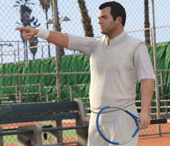
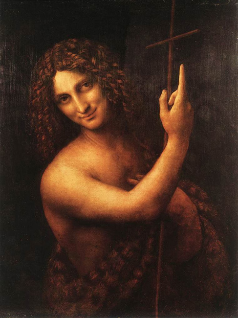
Implied lines are very powerful tools of the graphic designer. A psychological study conducted by researchers at the universities of Exeter and Lincoln found that biological cues, such as eye-gazing and finger-pointing were far more powerful to the human psyche than text-based (left, right) or icon-based cues (arrows). The reasons for this may lay in the fact that a biological cue relates to how we may read a person and a person’s body language. A person might pass on important cues to us with their body language. Looking at something may be a hint that was not given intentionally by the sender (of the information). Read more at: Psychology Study Points to Giving Arrow the Finger at University of Lincoln site. Gestures are powerful visual cue used in graphic design and were ever-present in art of many epochs. Renaissance painters like Michelangelo or Leonardo da Vinci placed visual cues into their paintings that were an indication of the artist’s views, it could represent criticism or say something about the subject. Leonardo’s Last Supper depicting the Jesus at his last supper with his apostles. Each of the hand gestures represent a message or code. There are many examples of finger-pointing in paintings, Michelangelo’s famous ‘Creation of Adam’ that can be found in the Sistine Chapel shows God reaching out to touch Adam. He seems to point at him with his index finger.

Many paintings show someone pointing towards heaven. This might show the importance of heaven in Christian belief. In Leonardo’s painting of St. John the Baptist it is believed to signify salvation through baptism that John the Baptist represents.
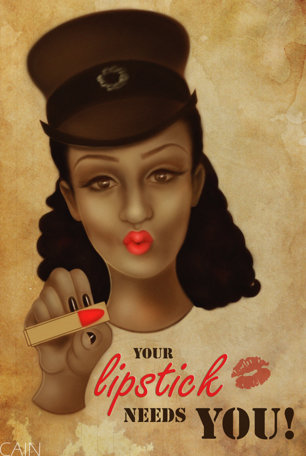
In 1914 a poster design by British designer Alfred Leere featured a picture of the British secretary of state for war, Lord Kitchener, pointing directly at the viewer, above the words “wants you.”
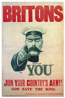
This design carried a powerful message that would stay with the viewer long after seeing the poster. One can only imagine what that poster did to the minds of young men of the early 20th Century. The Leere poster that was released became quite an icon and the concept of the finger pointing at the viewer has been reused in other recruitment posters of WWI and in other designs ever after. The Uncle Sam poster was released in 1916 and became possible more famous in a commercial context.

![The concept was used on the German side as well with this 'Auch du sollst beitreten zur Reichswehr' [You too should join the German Army], design by Julius Engelhard, Image: courtesy of mental_floss](https://classoffederico.files.wordpress.com/2014/04/world-war-propaganda_auch-du-sollst-beitreten.jpg?w=720)

Applying the eye gaze and pointing finger to a design piece can add a clear flow and focus to your design and assist the Visual Hierarchy and message of your work.
Also read:
More on Lines @ RAE, Research and Exploration
10 Top Photography Composition Rules at PM – Photography Mad
21 World War I Recruitment Posters From Around the Globe on mental_floss by Jill Harness
The paper Giving subjects the eye and showing them the finger: Socio biological cues and saccade generation in the anti-saccade task by Nicola J Gregory and Timothy L Hodgson was published in Perception, 2012 , Volume 41, Issue 2, pages 131-147. http://www.perceptionweb.com/abstract.cgi?id=p7085 Who is Emily the Strange? on http://www.emilystrange.com by HumanCat


![The concept was used on the German side as well with this 'Auch du sollst beitreten zur Reichswehr' [You too should join the German Army], design by Julius Engelhard, Image: courtesy of mental_floss](https://classoffederico.files.wordpress.com/2014/04/world-war-propaganda_auch-du-sollst-beitreten.jpg?w=441&resize=441%2C563#038;h=563 "world war propaganda_Auch du sollst beitreten")


